Michael Jackson's Death Photo -- Frightening Intentions?
Michael Jackson's Death Photo Frightening Intentions?
Published
|
Updated
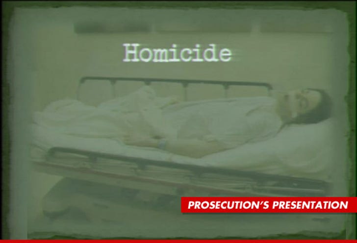
It seems the prosecution wanted to give the Michael Jackson death photo a murky, gritty treatment before it was presented in court this morning -- because it was clearly touched up to look as daunting as possible.
It appears the photo is NOT the original pic -- because now it includes a tattered border, a morgue-esque green hue ... and the word "Homicide" printed over MJ's body in a grainy, police-style font.
The prosecution used the photo as the background for a slide-show presentation in court.
Compare the pic to a cleaned up version of the photo (below) -- is the murky photo more likely to shake the jury?
We gotta ask ...


